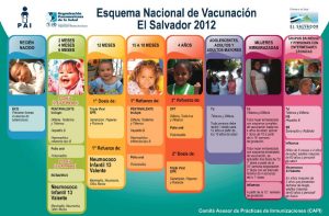
Somewhere within Spanish levels 2 or 3 everyone gets around to a unit on health. We do one in both levels, going more in depth in level 3, and then explore the concept as it relates to global issues in AP. So this infographic from the Ministerio de Salud de El Salvador makes a perfect authentic resource to explore and discuss.
Here are examples of the questions I asked my AP students to answer based on this resource:
- ¿Qué piensas que significa ‘esquema’?
- ¿Para qué país es este esquema?
- ¿A qué edad se debe recibir la vacuna combinada de ‘pentavalente’?
- ¿Qué es una organización que recomienda este esquema?
- ¿Para qué es la vacuna BCG?
- Escribe el nombre de una vacuna oral.
- ¿Por qué recibiría una mujer embarazada 2 dosis de TD?
- ¿Qué es un ejemplo de “grupo en riesgo [de contagiar enfermedades]”?
- Por lo normal (p. ej. adultos), ¿con qué frecuencia se recibe la vacuna de TD?
And, because in that class we read the novel Ciudad de las bestias, in which (spoiler alert!) it turns out the good doctor’s vaccine vials are actually filled with a lethal dose of measles, I ask if students can guess what sarampión means.
Infographics make an excellent authentic resources for learners because of their high level of contextual clues. For many more infographics you can use in your class, sign up to receive updates from the blog Infografías en castellano.
1 Comments
Comments are closed.


Infographics like this are a great tool for learning (or teaching) new sets of vocabulary. Being more of a visual learner myself I find that they really help me to remember the new words that I learn. They also make a nice break from the more monotonous reading and writing which is usually associated with learning a new language.
Joe.